Client
My Role
Platform

The Jackpocket app users were experiencing the inability to choose how they would receive their winnings. By addressing a key feature that had left many feeling restricted; it provided a flexible, player-first solution, giving users more control over how they manage their winnings.


It began with an in-depth market analysis for the Jackpocket app toggle add-on, by identifying key trends, user frustrations , competitor insights, and strategic opportunities to lead in the lottery mobile space.

A comprehensive analysis for the Jackpocket feature toggle was aimed at identifying trends in the lottery space. Assessing user needs and pain points to position Jackpocket as a leader in lottery mobile space.


The key insights gathered that were used to guide the project:
Interviews and surveys: Participants expressed a strong focus on sustainability and highlighted several pain points. One of the main priorities identified was simplifying the ordering process and determining the best approach for implementation.
Market Analysis: A thorough analysis of existing lottery apps revealed a significant shortcoming in the user experience related to placing orders. The assessment compiled detailed information on the ordering workflow and the setup of winnings options.
Persona Development: Detailed personas were created, to gain a perspective for each with unique needs.
User Testing: A/B testing, internal testing, feedback, and testing again.
This project presented several edge cases that required design iterations. However, the focus of this project was to add a feature for the lack of a lump sum or annuity option to the users.

Users recommended adding an option to provide details on claiming their winnings.
Providing an icon explaining the winning options available to users.
To provide users with clear and easily understandable options.
No choices for users on how to receive winnings.

The initial prototype failed, with users describing it as having “limited winning options.” To turn things around, an exploratory design sprint was conducted to brainstorm solutions and refine the focus on the most critical user pain points. The key improvement was providing two distinct winning options, clearly allowing one to override the other.

Carefully structured to provide an intuitive user journey, balancing item content, interactive features, and user friendly engagement.
Early wireframes led to interactive prototypes, which were tested and iterated on. This phase was crucial for refining user flows and interface elements.
Creating a visually appealing and emotionally engaging experience. The design incorporated nature-inspired themes, intuitive icons, and an easy-to-navigate layout.
Special attention was given to making the app engaging and easily navigable. Add-ons and information icons were also included in the ordering process.
Starting with low-fidelity wireframes allowed for efficient refinement and iteration before moving to high-fidelity designs informed by feedback. In the hi-fi stage, I incorporated detailed elements like visual hierarchy, while maintaining branding to enhance the user experience; making it more intuitive, engaging, and user-friendly.


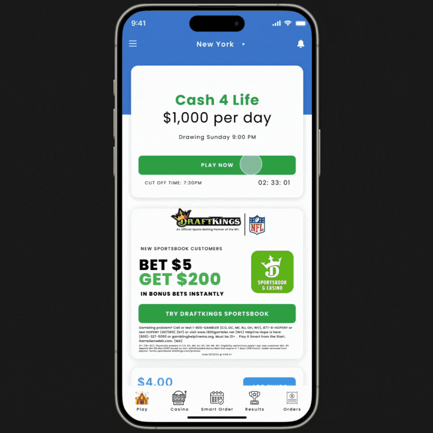
User opens the lottery app, selects their preferred game, and chooses numbers by tapping on the screen or using the app’s quick-pick feature. After reviewing their selection, they confirm their numbers and complete the purchase with a simple tap on the following screen.


After a user selects their lottery numbers, the user is directed to the purchase screen where one can review choices. Here, the. user is presented with the new feature option to choose either a lump sum payout or annuity payments, and once the user selects their preferred payout method, they finalize the purchase by tapping the confirm button.
After developing a clear and efficient solution for users to choose between a lump sum or annuity option, it became evident that an information icon was necessary. This would help users understand their selection and the reasoning behind it when deciding on their winnings options.

The Jacpocket lottery app offers an exceptional user experience, especially with the added option to choose between a lump sum or annuity payout, giving players more control over their winnings. This feature directly addresses user needs for transparency and flexibility, while simplifying the decision-making process for big wins. By streamlining the interface and eliminating frustrations like complex navigation, the app ensures a smooth, enjoyable, and stress-free lottery experience.