Client
My Role
Platform

Churro-Go was conceptualized to bridge the gap between busy people on the go and for those that just need to satisfy their sweet tooth in a visually engaging app.


It started with an in-depth market competition analysis for the Churro-go app, highlighting key industry trends, competitor strengths and weaknesses, and strategic opportunities to position ourselves as a leader in the snack ordering market.

A thorough in-depth person analysis for the Churro-go app aimed to highlight trends in the food ordering space, assess user needs, and identify strategic opportunities to position ourselves as a leader in the pastry market.


Key insights that were gathered to guide the project:
User Research: Interviews and surveys were conducted. Key findings included a widespread interest in sustainability, pain points, and to prioritize a simple ordering process, and how to implement it.
Market Analysis: A thorough examination of existing food ordering apps revealed a gap in ordering. This analysis combined ordering information, setup, and product recommendations.
Persona Development: Detailed personas were created, to gain a perspective for each with unique needs.
User Testing: A/B testing, internal testing, feedback, and testing again.

This project presented multiple edge cases, which required design iterations. One particular edge case that stood out, is assuring there was a clear focus state to assure users know that an item is selected.

90% of user responded on being unclear when item(s) was selected on the app.

Users were confused or disoriented by visual hierarchy.

Users had low rentention while on the app.
An Exploratory design sprint was conducted to brainstorm solutions and narrow the focus to the most important pain points from our users which was adding and ordering an item.

Carefully structured to provide an intuitive user journey, balancing item content, interactive features, and user friendly engagement.
Early wireframes led to interactive prototypes, which were tested and iterated on. This phase was crucial for refining user flows and interface elements.
Creating a visually appealing and emotionally engaging experience. The design incorporated nature-inspired themes, intuitive icons, and an easy-to-navigate layout.
Special attention was given to making the app engaging and easily navigable. Add-ons and quantity accumulation were also included in the ordering process.
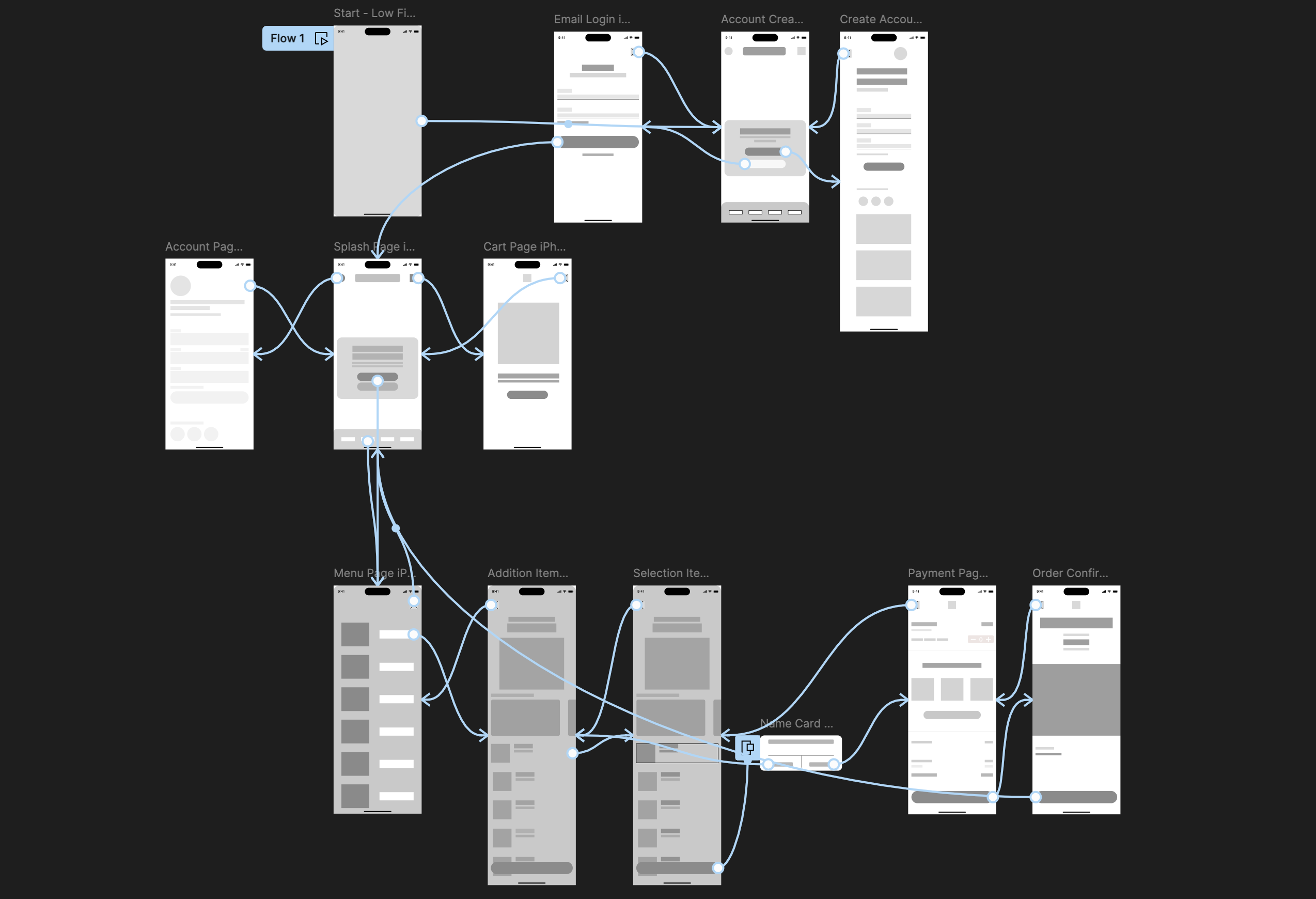
By starting with low-fidelity frameworks, this allowed to refine and iterate efficiently before transitioning to high-fidelity designs rooted in feedback. Once in the hi-fi stage, more detailed elements were incorporated like visual hierarchy, branding, and animations to enhance the user experience; making it more intuitive, engaging, and user-friendly.


To prevent users from feeling overwhelmed, the onboarding process offered only two options upon launch: sign in, or create a new account. This approach minimized cognitive load and provided a clear, straightforward path for users to engage with the app; ensuring a welcoming and intuitive entry point for all.


The design emphasized simplicity, with easily accessible controls for both item addition and quantity adjustment, ensuring a smooth experience for all users. From gathering continuous feedback through user testing, it lead to several iterative updates that enhanced usability and introduced new features based on real user needs. These updates improved the overall user experience and expanded the app's functionality, ensuring that it remained user-friendly.
Users generally want to navigate the app quickly and avoid redundant tasks. A/B testing helped fine-tune the placement of key elements like pickup times, payment options and confirmation buttons. Users were given instant validation, making the entire payment experience more intuitive and efficient.

After the redesign, the app became much more streamlined and user-centric. Visual hierarchy was improved, ensuring that essential features like ordering churros, flavors, and checking out were easily discoverable. Enhanced feedback animation mechanisms, and smoother transitions were introduced to guide users through the process seamlessly. Ultimately, the redesign created a more engaging, enjoyable, and user-friendly experience that kept users coming back!


The Churro-Go App's development was a valuable learning experience, emphasizing the importance of staying in low fidelity as long as possible. This strategy allowed for rapid iteration and easy adjustments based on user feedback, avoiding premature commitment to polished designs. By refining ideas early, it ensured that the transition to detailed design stages was efficient and aligned with the app's goals.
