
Client
My Role
Platform

Brokerage giant was experiencing user attrition due to a confusing interface. The Vanguard brokerage add-on feature was designed to simplify the complex world of investing into a more accessible and visually easy-to-read format upon login to adapt to user expectations and needs.


The Vanguard add-on feature began with an in-depth market analysis by identifying key trends, competitor insights, and strategic opportunities to lead in the stock market brokerage space.

A comprehensive analysis for the Vanguard add-on aimed at identifying trends in the stock market. Assessing investor needs and pain points to uncover strategic opportunities, positioning Vanguard as a leader in investment solutions.


The key insights gathered that were used to guide the project:
User Research: Interviews and surveys were conducted. Key findings included a widespread interest in sustainability, pain points, and to prioritize a simple ordering process, and how to implement it.
Market Analysis: A thorough examination of existing food ordering apps revealed a gap in ordering. This analysis combined ordering information, setup, and product recommendations.
Persona Development: Detailed personas were created, to gain a perspective for each with unique needs.
User Testing: A/B testing, internal testing, feedback, and testing again.

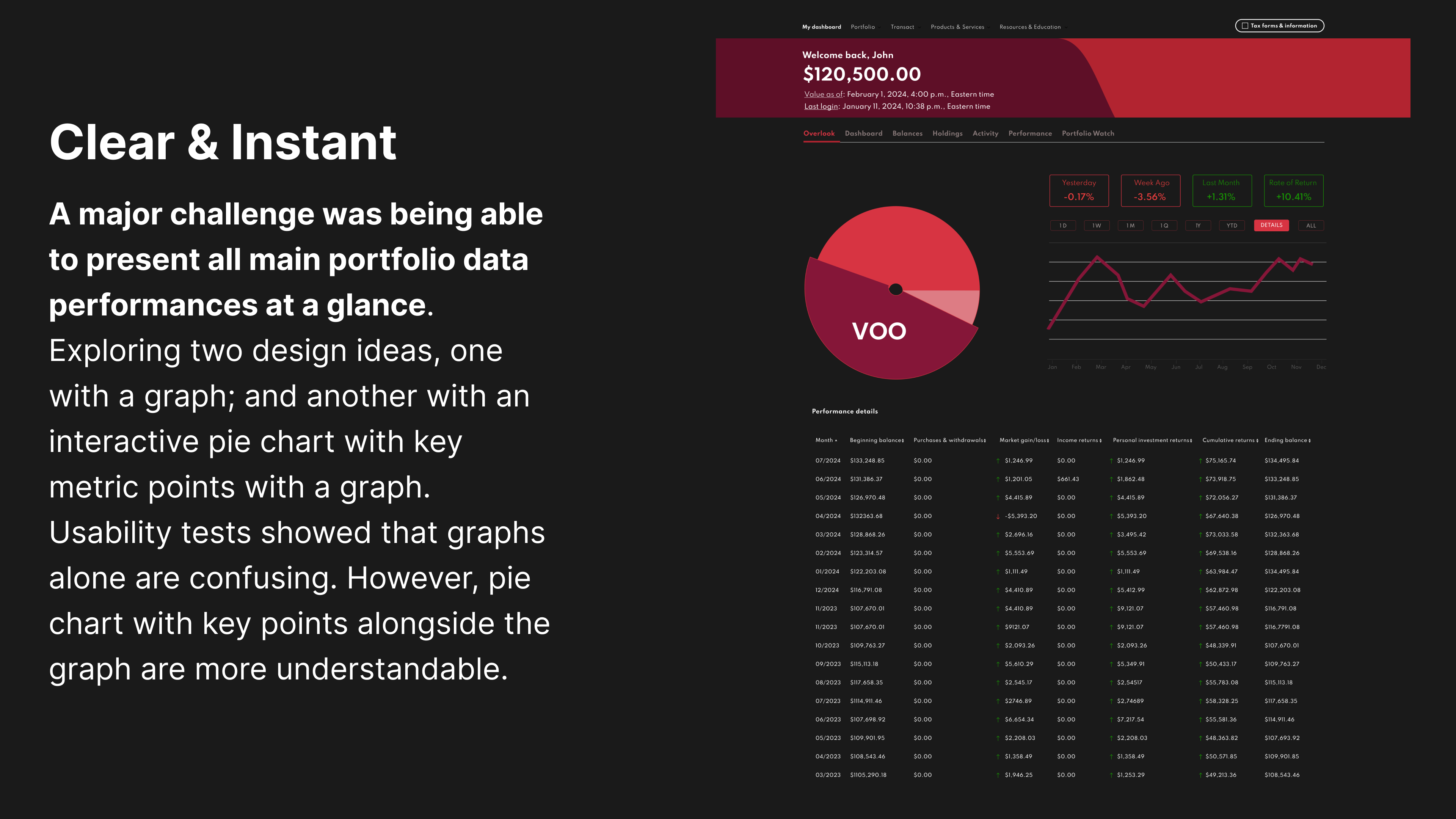
This project presented several edge cases that required design iterations. One standout was creating a visually engaging solution to display portfolio performance as soon as the user logs in.

High visual complexity.
Lacks user centric approach.
Lack of intuitiveness.
Users responded for an option to show more information upon login would be more beneficial.
Inability to switch between indices within the portfolio to view performance at a glance in real time.
Too many tabs and steps within the website to reveal the overall gains and loses.
Initial prototype faced significant challenges. Users called it 'confusing' and 'overwhelming'.


Here's how it was turned around. An exploratory design sprint was conducted to brainstorm solutions and narrow the focus on the most critical user pain points, specifically breaking down performance on individual indices.
Carefully structured to provide an intuitive user journey, balancing item content, interactive features, and user friendly engagement.
Early wireframes led to interactive prototypes, which were tested and iterated on. This phase was crucial for refining user flows and interface elements.
Creating a visually appealing and emotionally engaging experience. The design incorporated nature-inspired themes, intuitive icons, and an easy-to-navigate layout.
Special attention was given to making the app engaging and easily navigable. Add-ons and quantity accumulation were also included in the ordering process.
Starting with low-fidelity wireframes allowed for efficient refinement and iteration before moving to high-fidelity designs informed by feedback. In the hi-fi stage, I incorporated detailed elements like visual hierarchy, branding, and animations to enhance the user experience, making it more intuitive, engaging, and user-friendly.


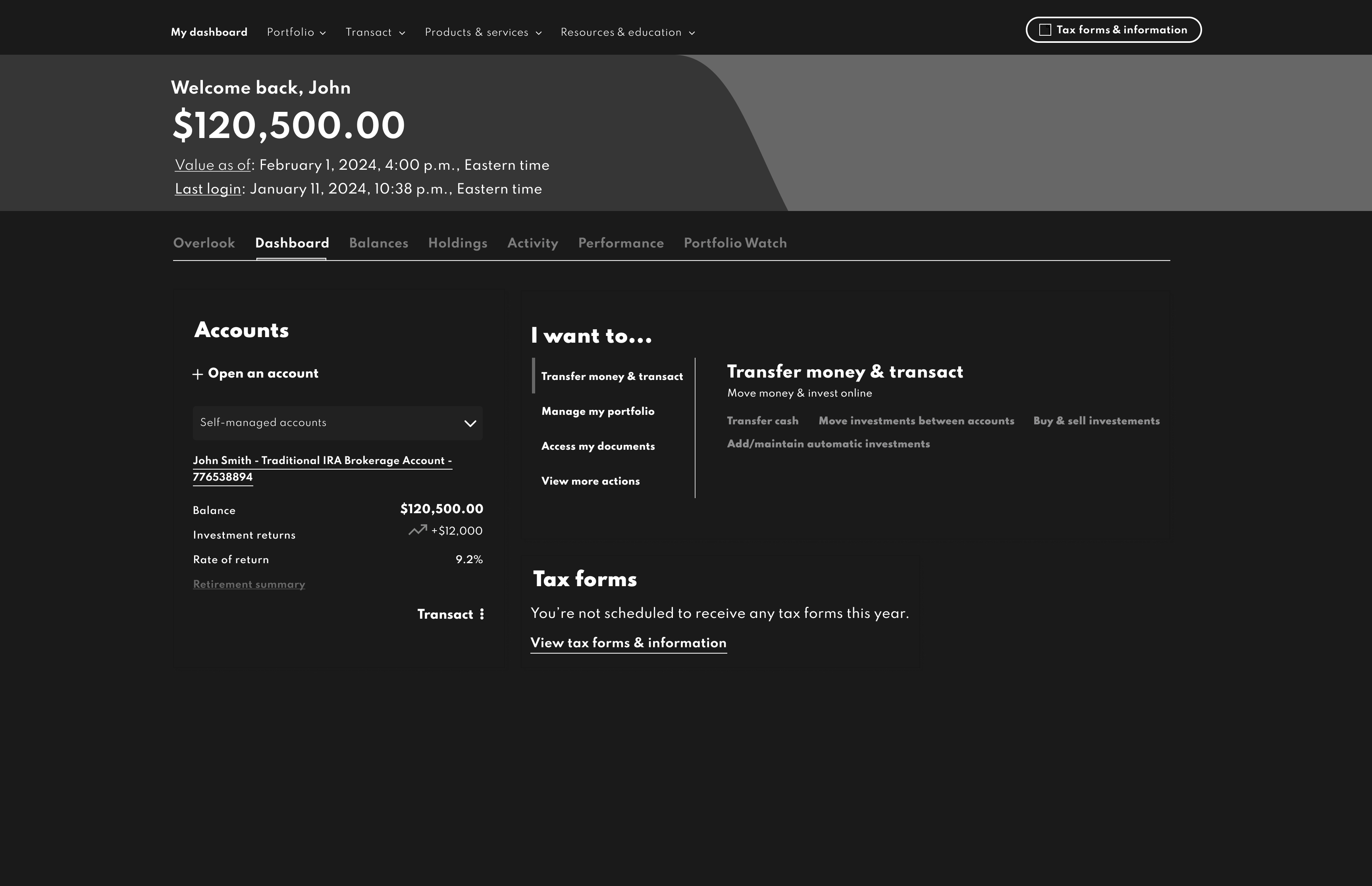
Upon sign-in, our goal was to ensure the user experience is clear, intuitive, and straightforward. The focus was on minimizing friction, providing clear instructions, and designing a seamless flow that guides users effortlessly through the process.


This project presented multiple edge cases. After exploring where users had low retention and confusion; I prioritized interactive tracking and visualized progress after login.
A solution was established for an efficient and clear path for the user to access portfolio data, designing for the edge cases became easier with a reference point.


90% of Vanguard clients use the desktop version. However, they can also log in via the mobile app from time to time. Therefore, design was adapted for a mobile version based on the desktop design.
Previously, finding the portfolio’s performance required three clicks or more. Now, it's prominently displayed on the splash page, just one click away from the user instantly accessing performance after login. This solution not only addresses the confusion issues from the past, but also streamlines the user’s key metrics on their portfolio’s data and performance.

Before, users had to click aimlessly to access their portfolio's performance. Now, it's featured directly on the splash page, making it just one click for instant access. This Vanguard add-on update not only resolves past confusion, but also simplifies how users view essential metrics and portfolio performance data.
